
Project's name:
For this project, the focus was on building Banfield’s first scalable design system that teams could actually use every day, not just read about in a PDF. I audited existing products, defined the visual foundations, and rebuilt core components in Figma with variants, auto layout, and accessibility baked in, then documented everything so designers and developers could move faster together and ship with confidence.
In this case study, I would like to share my experience developing a dynamic design system that will replace the traditional pdf style guide. A new design system that will manage and maintain all reusable components and patterns guided by clear standards that the product team uses to create a consistent experience across a range of products.
In a short time frame, we assembled a core team, built processes, introduced new tools for work, and laid the foundations of our design system. In this discussion, I'll cover the approach and processes employed at the interface design and technical development levels.
Let's explore the strategies that have guided our work and the seamless collaboration between these crucial aspects of our projects.
The design system was intended for our esteemed internal team of designers and developers at Banfield, and it may also extend to external contract team members. This exceptional group of individuals will benefit from the system's seamless collaboration and comprehension. The design system should showcase a clean and intuitively structured interface to achieve this. Emphasizing simplicity and clarity, each element and component will be thoughtfully crafted for easy understanding.
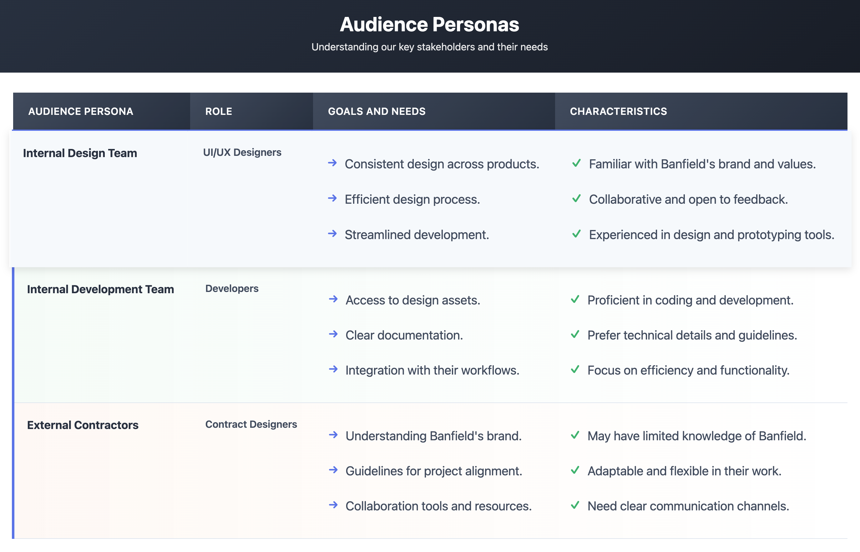
This table summarizes the key personas involved in our design system project at Banfield Pet Hospital, their roles, goals, and characteristics:
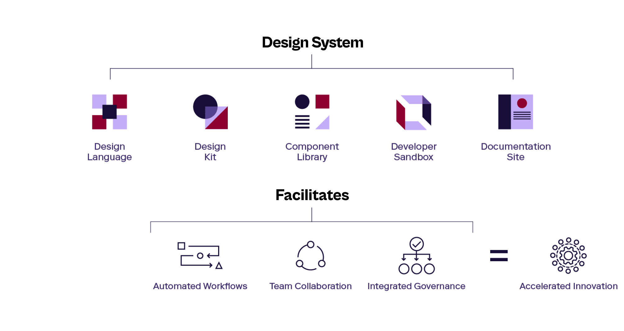
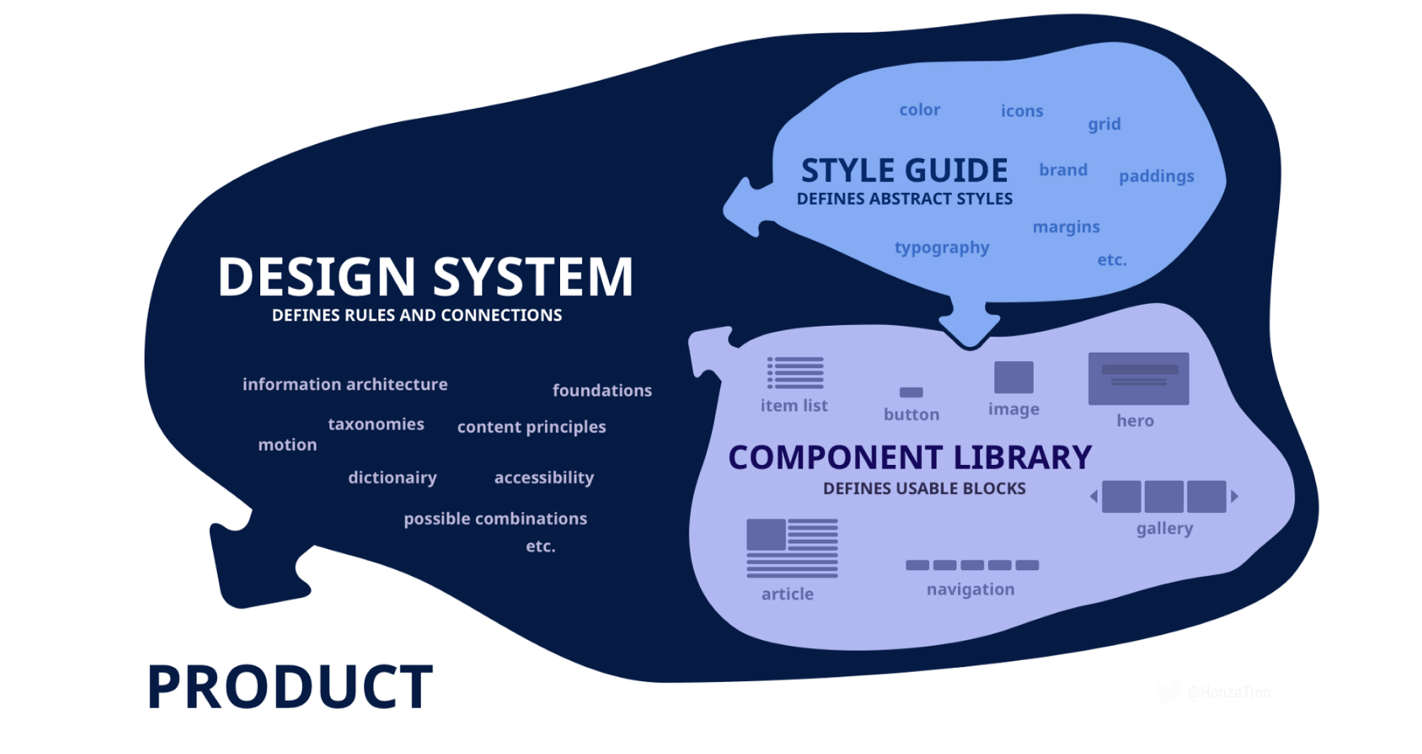
SO let's first have a brief introduction about what a Design system is. A Design System (DS) serves as the definitive source that organizes, manages, and maintains all reusable and scalable components, codes, and patterns. It adheres to clear standards, streamlining product creation, testing, and development processes while ensuring consistency across various pages and channels. This powerful tool empowers our product team to deliver exceptional results, fostering a seamless and professional workflow for the benefit of our users and stakeholders.
Banfield faced challenges with a fragmented style guide that needed more cohesion across company brands and teams. The old style guide and documentation required to be more precise, leading to inconsistent styles and components in our products. This complexity made it difficult for designers and developers and directly impacted the end-user experience.

As we set out on our Design System journey, we came across various challenges. These hurdles included:
1. Understanding Existing Implementation: A thorough understanding of how the brand style was previously implemented across teams and products is crucial before introducing a new design system. This helps ensure a seamless transition and integration of the new system.
2. UI inventory: Gathering reusable components from previous products, including web and mobile, and transforming them into concise main components with variables can be complex. This process was essential for the success and consistency of the design system.
3. Introducing the New Tools to Stakeholders: Effective communication and presentations are essential to create a powerful design system. Introducing the new system to stakeholders requires clear explanations and showcasing the benefits they bring to the design process.
4. Adoption and Documentation Challenges: One of the biggest challenges in design system maturity for companies lies in ensuring widespread adoption among team members. Additionally, creating comprehensive and user-friendly documentation is vital to aid in understanding and usage.
5. Continuous Improvement: A design system is an ever-evolving entity and should never be considered a one-time project. It requires an ongoing commitment to keep it updated and aligned with changing needs and trends.
One design system to rule them all
To address these issues effectively, our goal is to develop a comprehensive design system that builds a strong continuous foundation that unifies our approach, fosters collaboration, boosts productivity by working smarter, not harder, and delivers exceptional user experiences.
In approach, we tackled our first challenge by examining various Banfield web and mobile products. We discovered remarkable inconsistencies in colors, font styles, illustrations' shape and color, spacing, and white spacing. This valuable insight laid the foundation for our design system, ensuring a cohesive and unified user experience.
Below is a visualization of all the different styling variations across our products at that time:
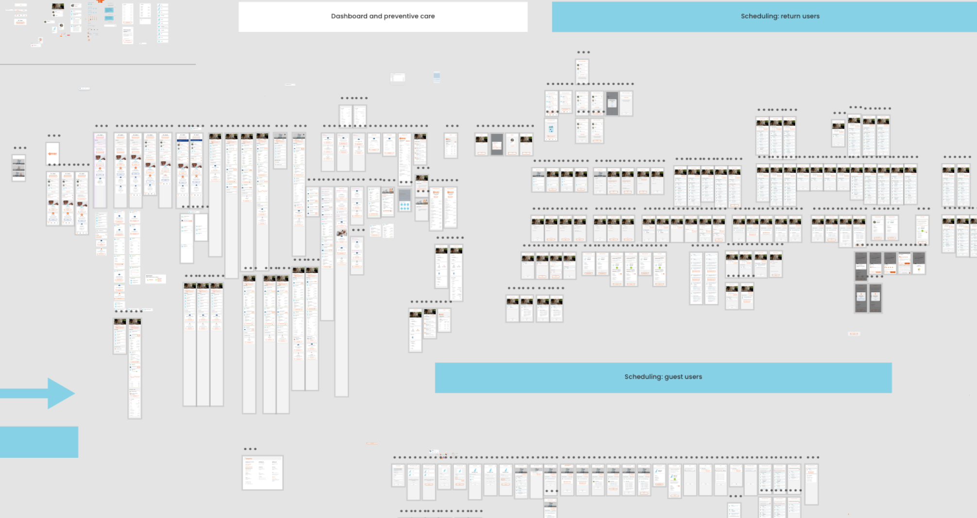
As you can see, the more product is built up, the more inconsistency we have, so defining this issue makes us more confident that we are on the right path building a new foundation to unify the whole style linked to only one source.
Although it was evident that this project would demand significant resources, planning, and time, we firmly believed that this effort was a worthy and lasting investment in our company, brand identity, and the satisfaction of our valued customers.
We use the following steps to ensure the productivity:

We initiated a UI Inventory focusing on our primary interface elements to gain a deeper insight into our current design environment.
Through this process, we unearthed numerous irregularities within our design resources. This highlighted the imperative for a more systematic strategy in recording, conveying, and upholding our design system.
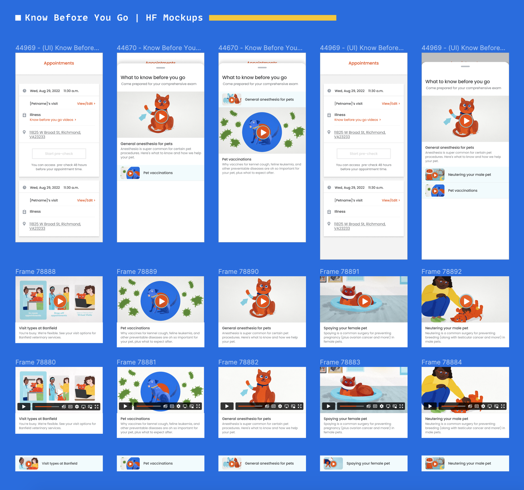
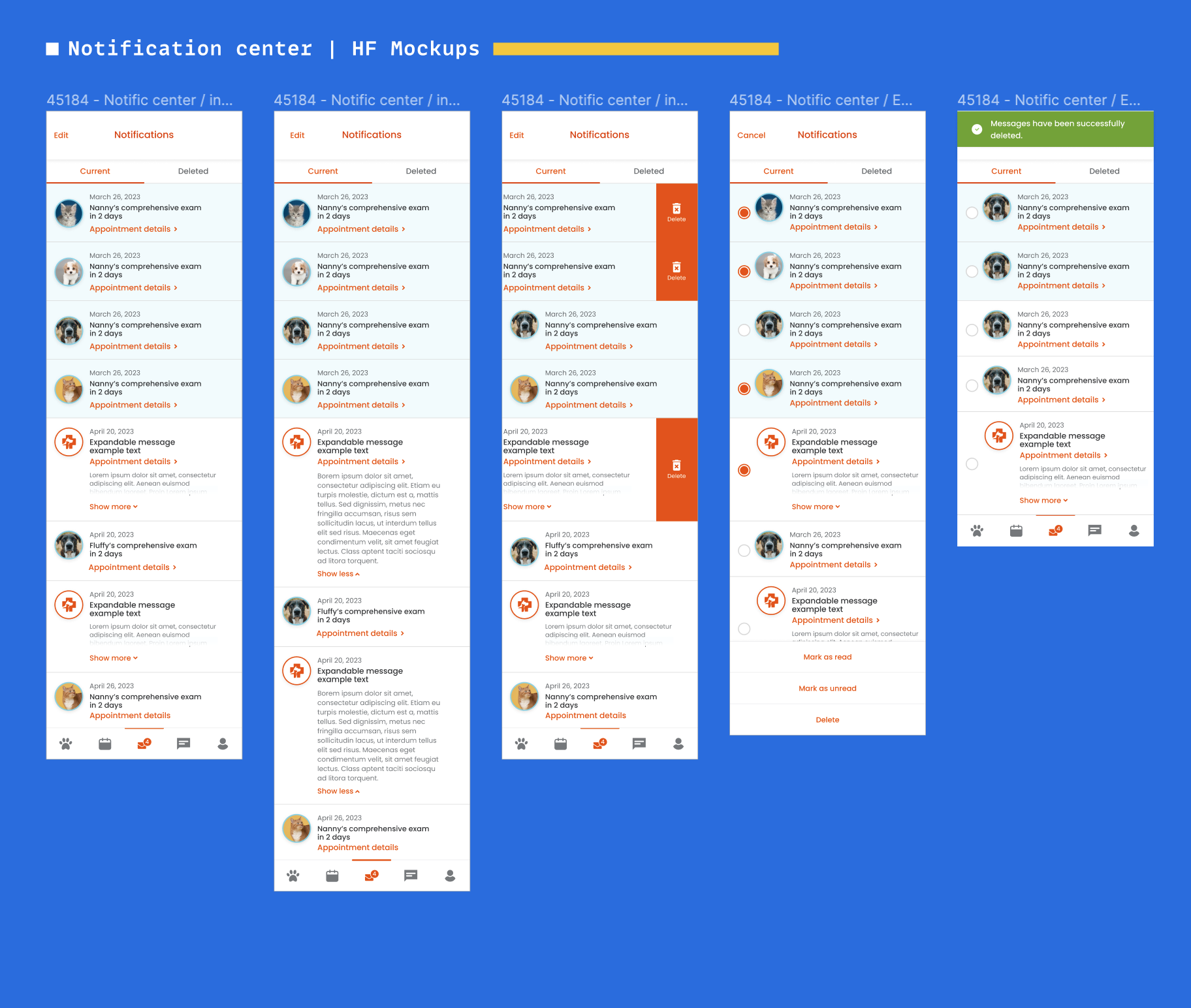
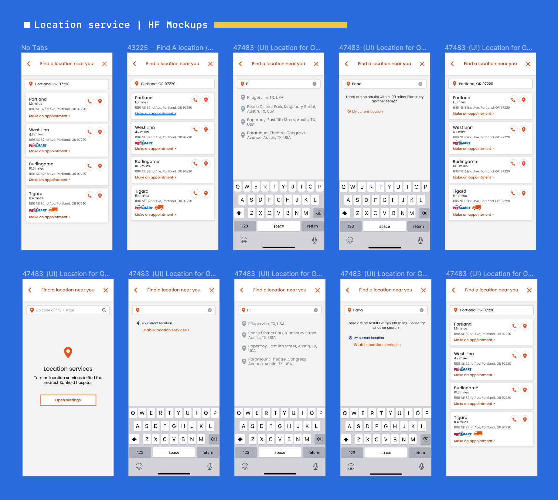
Here are a few instances of the component screenshots that we generated following this activity:
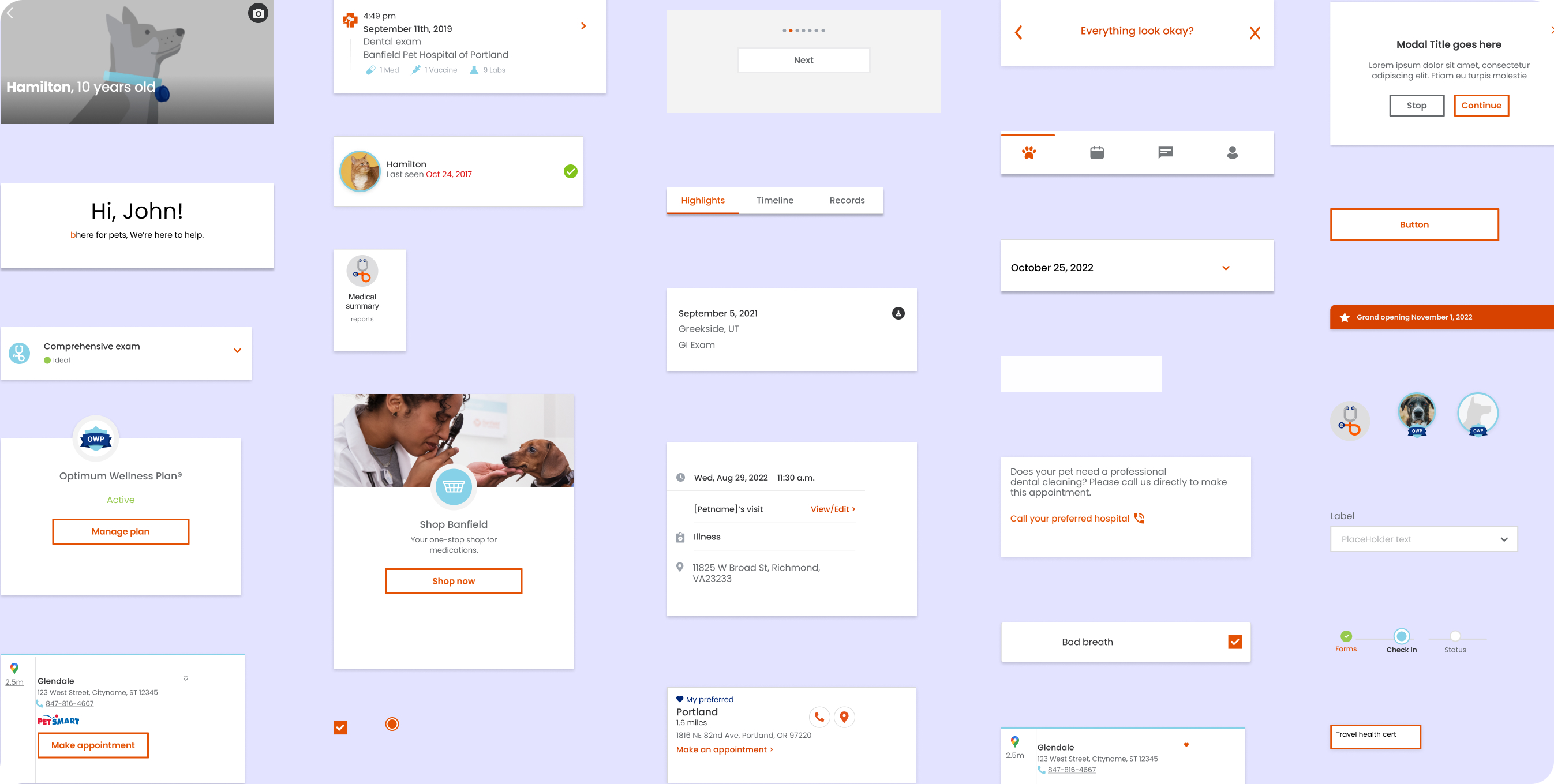
The inventory procedure enabled us to identify discrepancies and inconsistencies on our website and product clearly. This procedure laid the groundwork for our design system efforts. Using the findings from the audit, we established a priority roster for our design system's minimum viable product (MVP).
To ensure the project took off, we knew getting everyone on board before we even started building the design system was super important. Here's how we made it happen in a friendly and organized way:
We kicked things off with a big presentation that went company-wide. We talked about the project, pointed out the challenges we were facing, and showed how the whole organization could benefit from it.
We didn't stop there – we got our engineering teams in on the action right from the beginning. We had meetings and workshops every two weeks where they could share their thoughts and ideas about the design system.
We didn't keep things a secret either. We regularly let different teams know what we were up to and how the project progressed. This helped everyone stay in the loop and on the same page.
From the very start to all the way through, we included other teams every step of the way. We wanted everyone to understand what was happening and feel like they were a part of the journey with us.
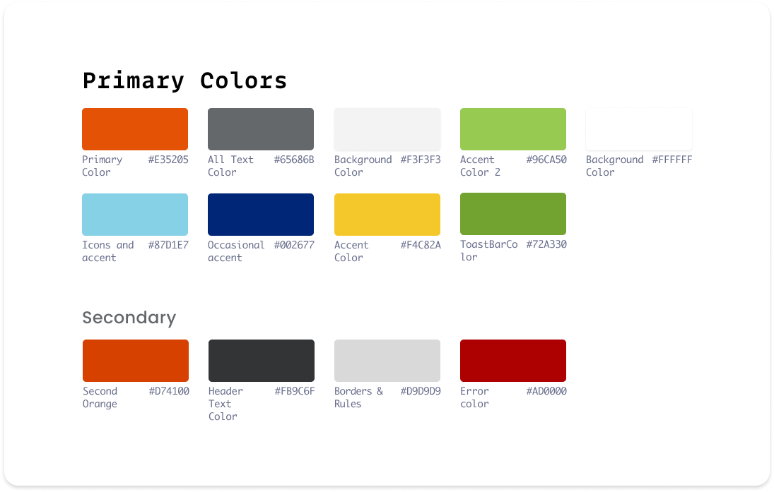
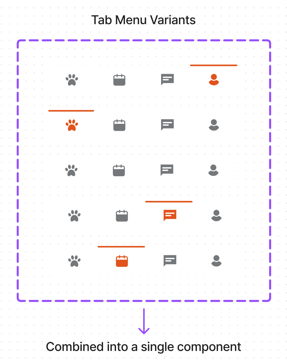
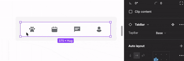
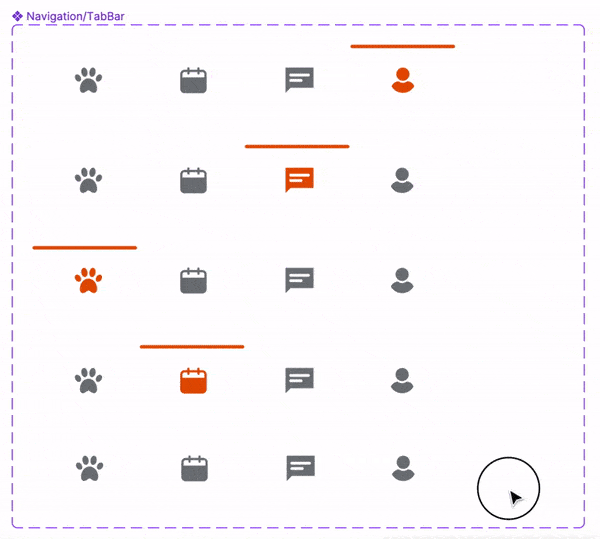
We started by focusing on our design system's essential parts (atoms), like colors, fonts, grids, spacing, buttons, etc. Then, we worked on more complex sections (molecules, organisms, templates, pages). Since we switched to Figma from Sketch, we made new components from scratch because Figma was better for our design needs.
At this stage, we did these things:
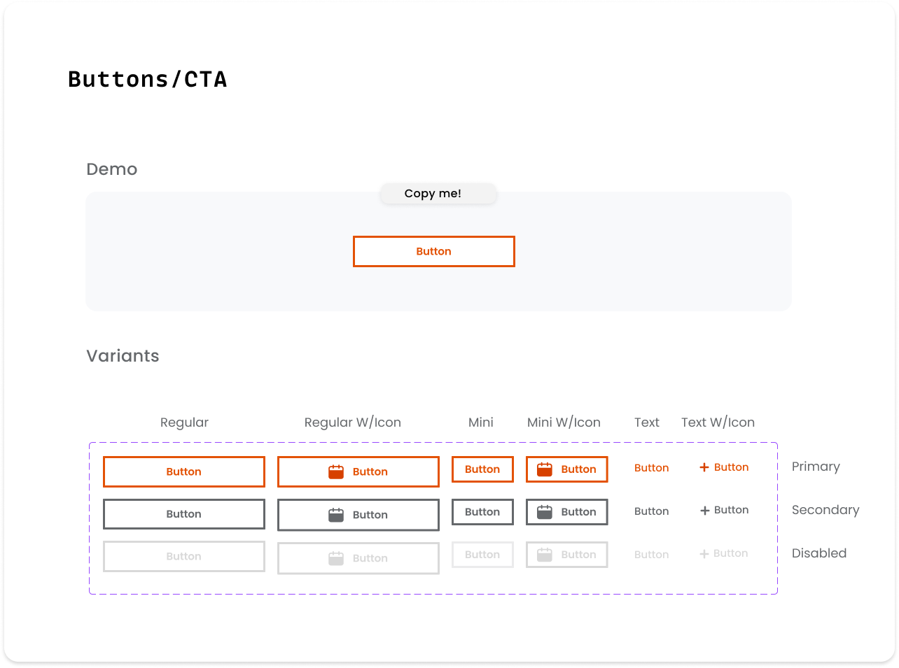
Having these two advanced features in Figma introduces a refreshing approach to the way we group and organize various versions of the same component. The concept of "Variation" simplifies the task of maintaining components, ensuring they remain in optimal condition, and enhancing their comprehensibility. With the ability to seamlessly merge variants into a unified component, you can infuse your creations with distinctive attributes and values.
Furthermore, harnessing the power of the Auto Layout feature empowers your designs to dynamically expand or contract as needed, effortlessly readjusting themselves to internal changes. This proves exceptionally valuable when incorporating new elements, accommodating longer text segments, or working with the same design across multiple devices' size.
The fusion of these two remarkable functionalities resembles a touch of enchantment – it magically transforms numerous components into adaptable, responsive entities capable of flexibly conforming and delivering extraordinary results!

With a focus on accessibility, we meticulously crafted each component to adhere to the WCAG AA accessibility standards. This ensures that our design looks excellent and provides an inclusive experience for all users, regardless of their abilities.

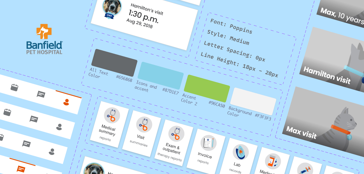
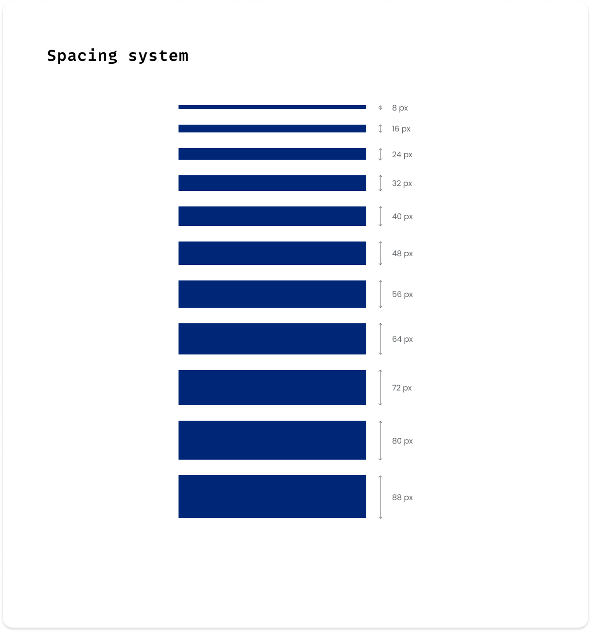
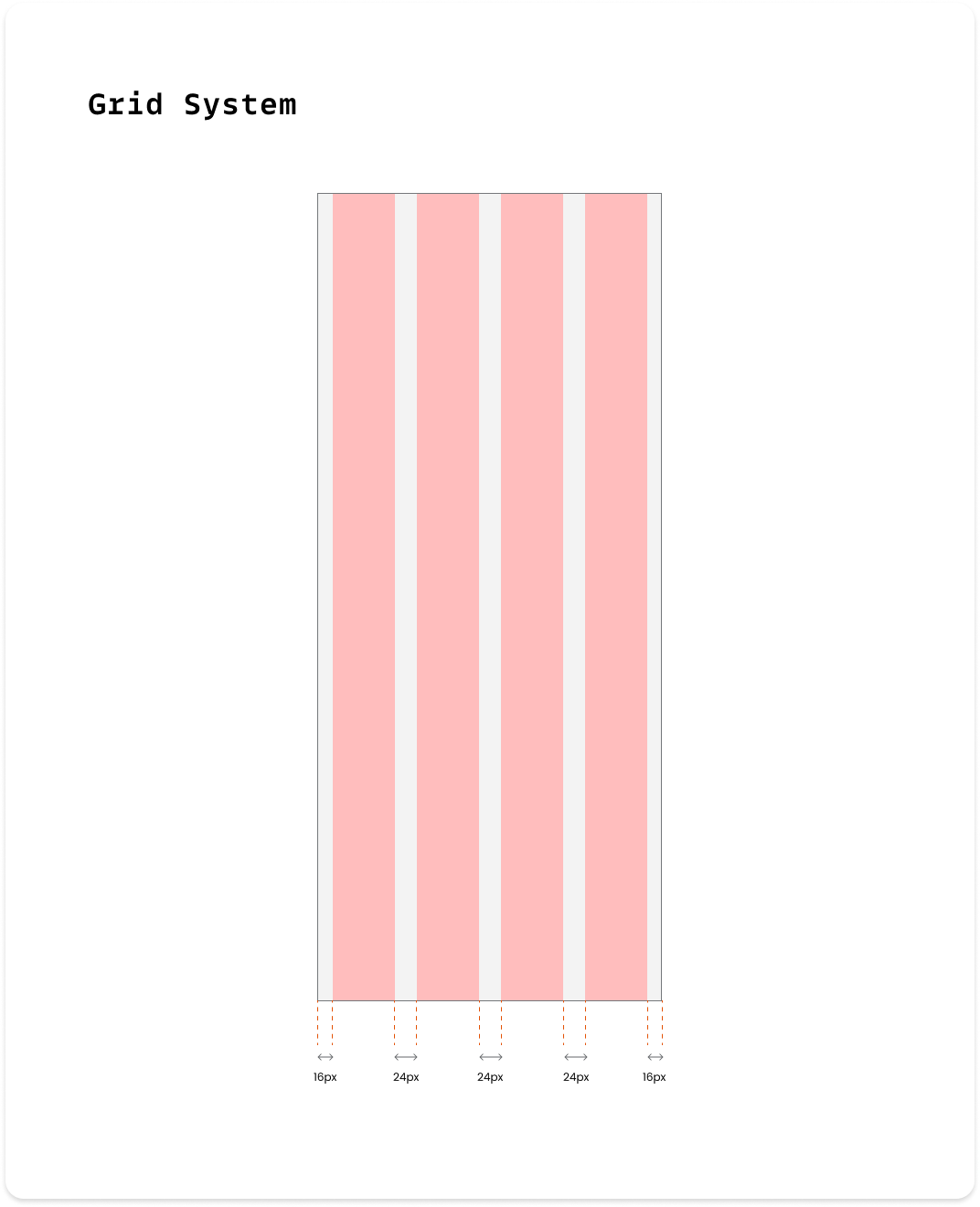
In addition to the design system elements mentioned earlier, we've also added a grid system layout with an 8-point grid for sizing, spacing, and laying out components relative to one another. This means that any padding, margin, button height, etc. is always a multiple of 8 pixels so designers can snap elements into place, keeping UI components together neatly and consistently.
The design system’s comprehensive tokens, components were adopted as Banfield's Enterprise UI framework for all newly created internal applications. This ensures consistency across products and teams while minimizing workflow friction.
The design system will keep getting better and bigger over time. Through consistent refinements and thoughtful additions, the design system will mature and establish itself as a robust foundation for creating cohesive and user-centric products.
Continue your exploration
Made with ❤ | © All rights reserved